The letter E has been combined with the addition of a circular frame indicating universality, to give a modern and innovative look.
In addition to the leaf shape to indicate that the brand uses natural and fresh ingredients for its products.
The crimson orange color was used as an indication of safety to confirm the quality of the company's products.
In addition to the leaf shape to indicate that the brand uses natural and fresh ingredients for its products.
The crimson orange color was used as an indication of safety to confirm the quality of the company's products.
Logo Guidelines
Stationery
Business Card
Envelope
Letterhead
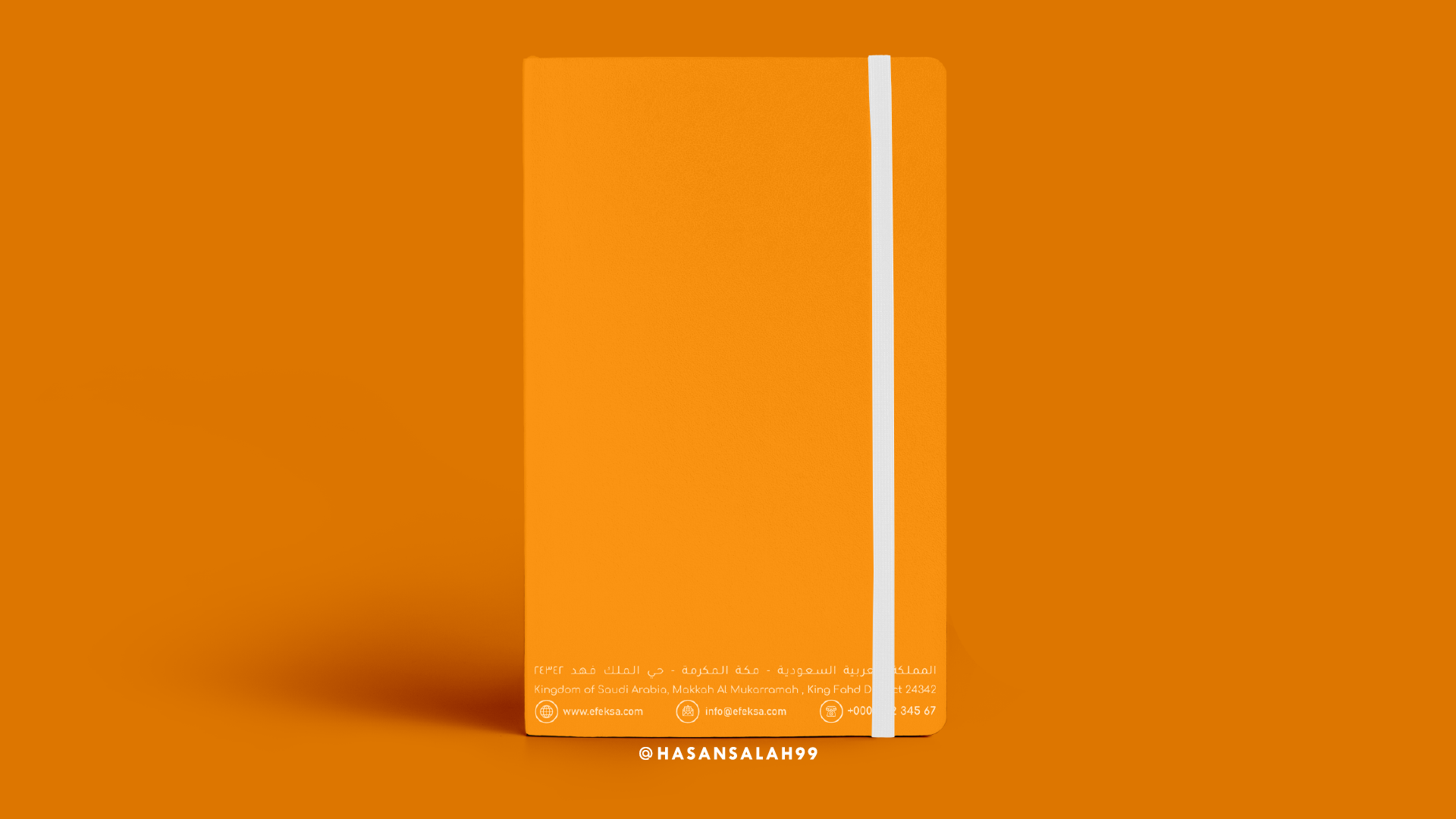
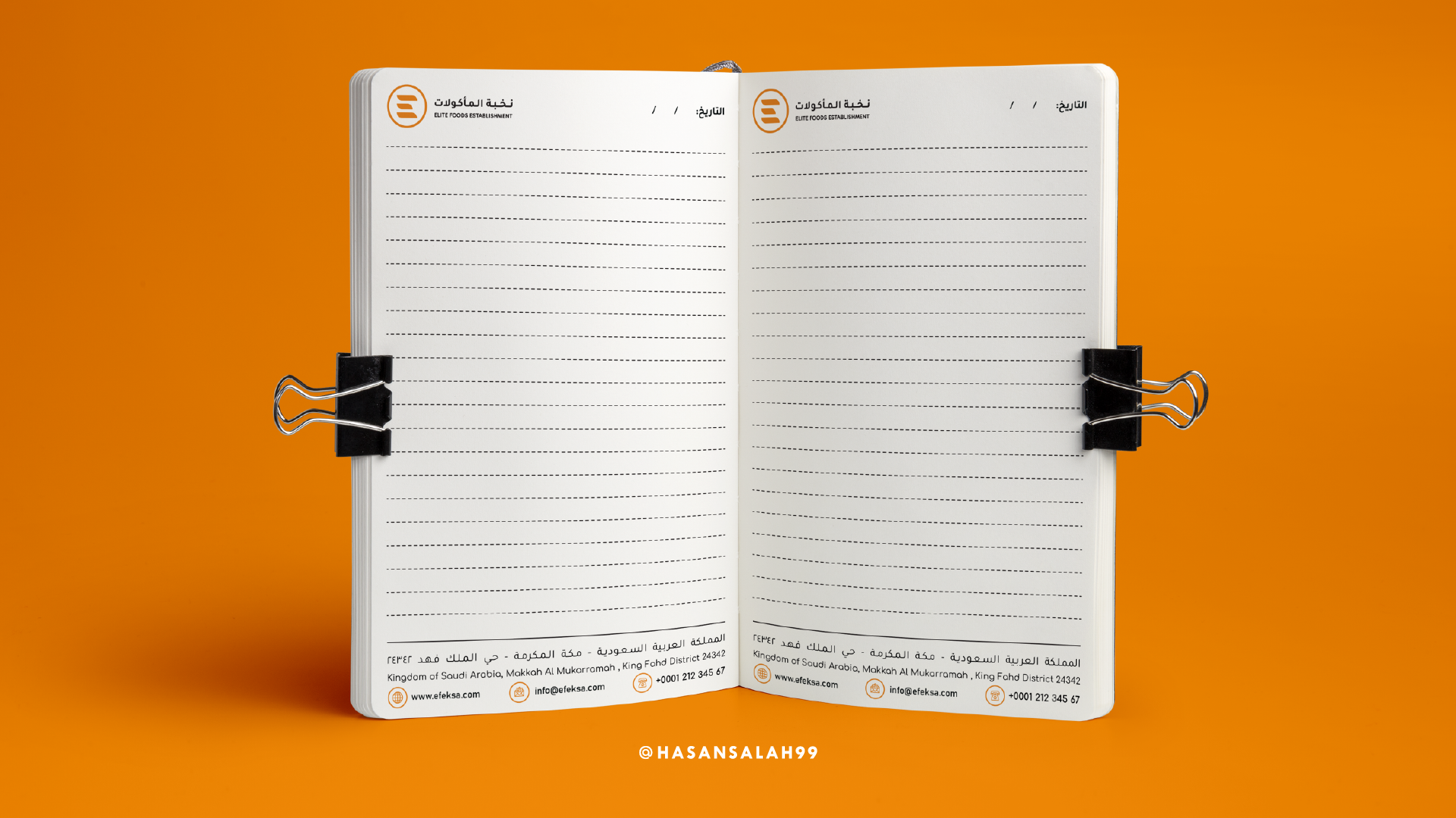
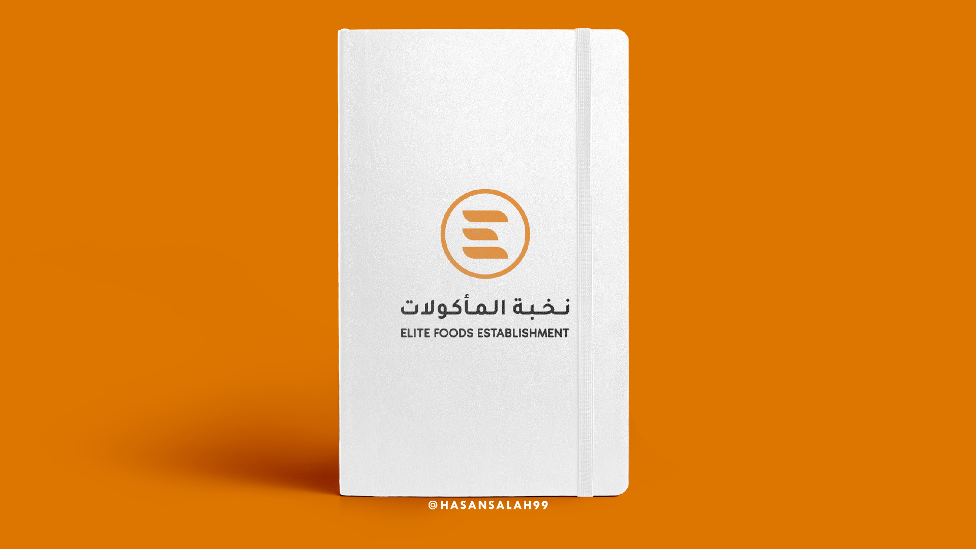
Note Book
Apron
Car
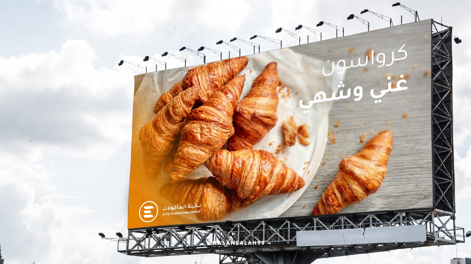
Billboard

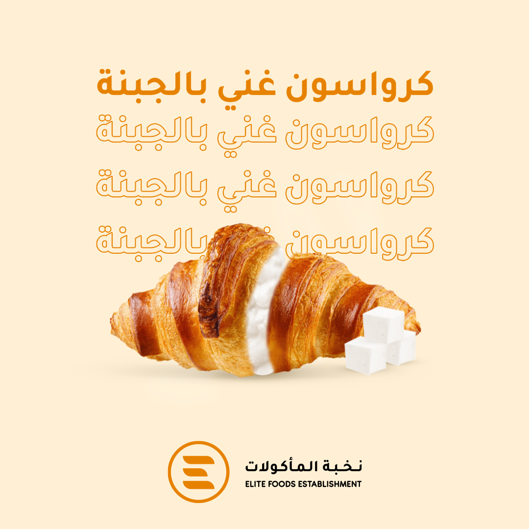
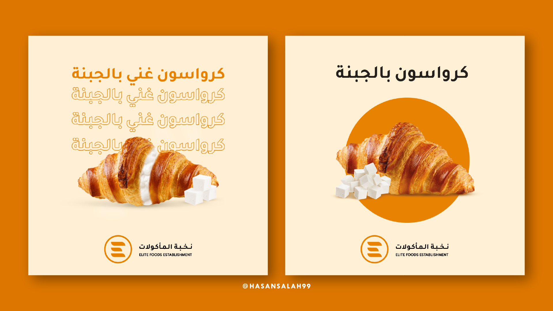
Social Media Design
Menu
Don't forget like, follow and share

